Choosing the right paint tones for your home can transform your living space, impacting everything from the perceived size of a room to the mood it evokes. While personal preference plays a crucial role, understanding the science behind color can guide you in making choices that enhance the functionality and aesthetics of each room. This blog delves into the psychology of color, practical tips for selecting hues, and how to create harmony throughout your home.
Understanding Color Psychology
Color psychology explores how different hues affect emotions and behaviors. This understanding is crucial when selecting paint tones for various rooms.
Here’s a brief overview of common colors and their psychological effects:
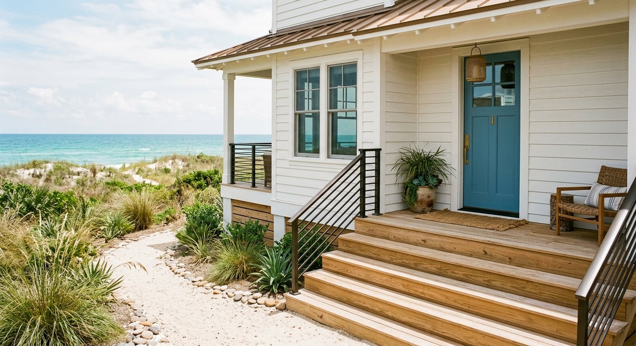
- Blue: Often associated with calmness and serenity, blue is ideal for bedrooms and bathrooms where relaxation is paramount. Lighter shades promote tranquility, while darker blues can add a touch of sophistication.
- Red: Known for its ability to increase energy and stimulate appetite, red works well in dining rooms and kitchens. However, it should be used sparingly in bedrooms and offices to avoid creating an overly stimulating environment.
- Yellow: Symbolizing happiness and warmth, yellow can brighten kitchens and living rooms. It is also known to stimulate mental activity, making it a great choice for home offices or study areas.
- Green: Representing nature and balance, green is versatile and suitable for any room. It is particularly effective in living rooms and bedrooms due to its calming properties.
- Gray: Offering sophistication and neutrality, gray is a popular choice for modern interiors. It works well in living rooms, kitchens, and bedrooms, providing a versatile backdrop for various design elements.
- White: Signifying purity and cleanliness, white can make spaces appear larger and more open. It is ideal for small rooms or areas lacking natural light.
Practical Tips for Selecting Paint Tones
When choosing paint tones, consider the following practical tips to ensure your selections enhance your living space:
1. Assess the Room’s Purpose: Different rooms serve different functions, and the paint color should reflect this. For example, a bedroom should promote relaxation, while a kitchen can be more vibrant and energizing.
2. Consider Natural Light: The amount of natural light a room receives can significantly impact how a paint color appears. Rooms with ample sunlight can handle darker shades, while rooms with limited light benefit from lighter tones.
3. Test Samples: Always test paint samples on your walls before making a final decision. Observe how the color changes throughout the day with varying light conditions.
4. Use Color Wheels: A color wheel can help you understand which colors complement each other. Complementary colors (opposite each other on the wheel) create vibrant contrasts, while analogous colors (next to each other) provide a harmonious blend.
5. Think About the Flow: Consider how colors will transition from room to room. Creating a cohesive color palette ensures a seamless flow throughout your home, enhancing the overall aesthetic.
Choosing Paint Tones for Specific Rooms
Living Room
The living room is often the heart of the home, where families gather and entertain guests. Warm tones like beige, taupe, and soft yellows create an inviting atmosphere. Alternatively, neutral grays and whites provide a sophisticated and versatile backdrop, allowing you to add personality with furniture and accessories.
Kitchen
Kitchens benefit from energetic and stimulating colors. Bold reds, vibrant yellows, and fresh greens can make the space lively and welcoming. For a more subdued look, consider shades of white or gray with colorful accents in tiles or cabinetry.
Bedroom
Bedrooms should be tranquil and restful. Soft blues, greens, and lavenders promote relaxation and restful sleep. Neutral tones like beige and soft gray also work well, providing a serene environment that can be easily accessorized with different textures and fabrics.
Bathroom
Bathrooms can be a sanctuary for relaxation and rejuvenation. Cool blues and greens create a spa-like atmosphere, while crisp whites enhance the feeling of cleanliness and space. For a touch of luxury, consider using metallic accents like gold or silver in fixtures and accessories.
Home Office
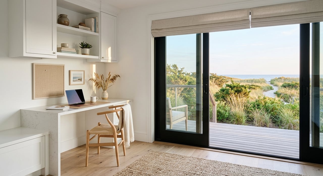
A home office should balance productivity with comfort. Stimulating colors like yellows and greens can boost creativity and focus. Alternatively, calming shades of blue can help reduce stress and improve concentration. Consider an accent wall in a bold color to add interest without overwhelming the space.
Dining Room
Dining rooms are perfect for experimenting with bolder colors. Reds and oranges can stimulate appetite and conversation, creating a lively dining experience. If you prefer a more formal setting, deep blues or grays add elegance and sophistication.
Creating Harmony and Balance
Creating a harmonious color scheme throughout your home involves balancing different hues and ensuring they complement each other.
Here are some strategies to achieve this:
1. Choose a Base Color: Start with a neutral base color that can be used throughout the home. This creates a cohesive foundation that allows you to introduce accent colors in each room.
2. Use Color Families: Stick to colors within the same family to ensure harmony. For example, if you choose a blue base, you can incorporate different shades of blue and complementary colors like green and purple.
3. Incorporate Patterns and Textures: Adding patterns and textures through fabrics, rugs, and accessories can create depth and interest without overwhelming the space with too much color.
4. Balance Bold and Neutral: If you use bold colors in one room, balance them with neutral tones in adjacent areas. This prevents the colors from clashing and maintains a sense of flow.
Choosing the right paint tones for every room involves understanding the psychological effects of colors, considering practical aspects like light and room function, and ensuring a harmonious flow throughout your home. By applying the science of color, you can create spaces that not only look beautiful but also enhance your well-being and lifestyle. Remember to test samples, think about how colors transition from room to room, and most importantly, choose colors that resonate with your personal style and preferences. With these tips, you'll be well on your way to a beautifully painted and thoughtfully designed home.
When attempting to traverse a niche market like the Outer Banks, you’re best suited when paired with an experienced agent. Brad Beacham has been a trusted name in this market for years, matching client after client with their dream homes in and around the Outer Banks. Consider him when beginning your journey to your next home.